When you’d like to drift a bit outside the colours that are best for you, it’s good to use the dimensions of colour to help your outfits hang together. Generally speaking, it’s best to stick with colours that are best for you (especially near the face) because they’ll help you look healthy and alive, but as a creative person, I can understand how you might want to step outside the boundaries every once in a while to liven things up. Remember that when you put things that are alike together, it creates harmony. When you put things that are different together, their differences are emphasized very strongly. However, there are things you can do to make a mix work – as with all mixes, repetition of the design elements is key. In colour, you’d use undertone, value and intensity (see last blog post for a visual) and the colours in a single palette will all work together because they share at least two of the dimensions and sometimes all three.
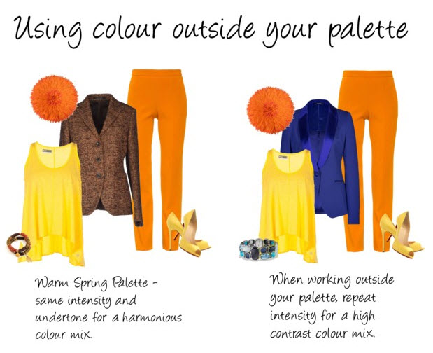
When you want to step outside the bounds of your palette, repetition and dimension of colour still applies. Here we’ll look at repeating intensity. In the example below, you’ve got a harmonious look on the left, where the pieces share the same undertone (warm) and intensity (high). On the right, you’ve got a blue jacket that has a different undertone (cool), but shares the same intensity as the pants and shirt (high), so it works together, but creates a high contrast look or ‘pop’.
The look you choose depends a lot on personal preference. I like harmony, so prefer to keep the contrast to a minimum, or use smaller accents outside of my palette as opposed to pieces of clothing and I don’t generally stray far because I like the way I feel when I wear the colours that really work for me. Want some help with your colours? Click here to get started, or view more colour mixing sets on Polyvore. Make it a colourful day!